Adding a feature
Venmo's Group Expense Feature: Simplifying Shared Spending
Overview
Venmo is a mobile payment app that allows you to easily send and receive money from friends. It has gained popularity due to its user-friendly interface and remains a widely used option for digital payments.
Problem
While Venmo recently introduced a split feature, it still misses crucial functions like group expense creation, receipt tracking, and handling multiple debts.
Solution
This project aims to enhance Venmo by introducing a group expense feature, enabling users to form expense groups, share bills, and monitor shared costs for activities, there by simplifying cost management.
Research
User Interviews
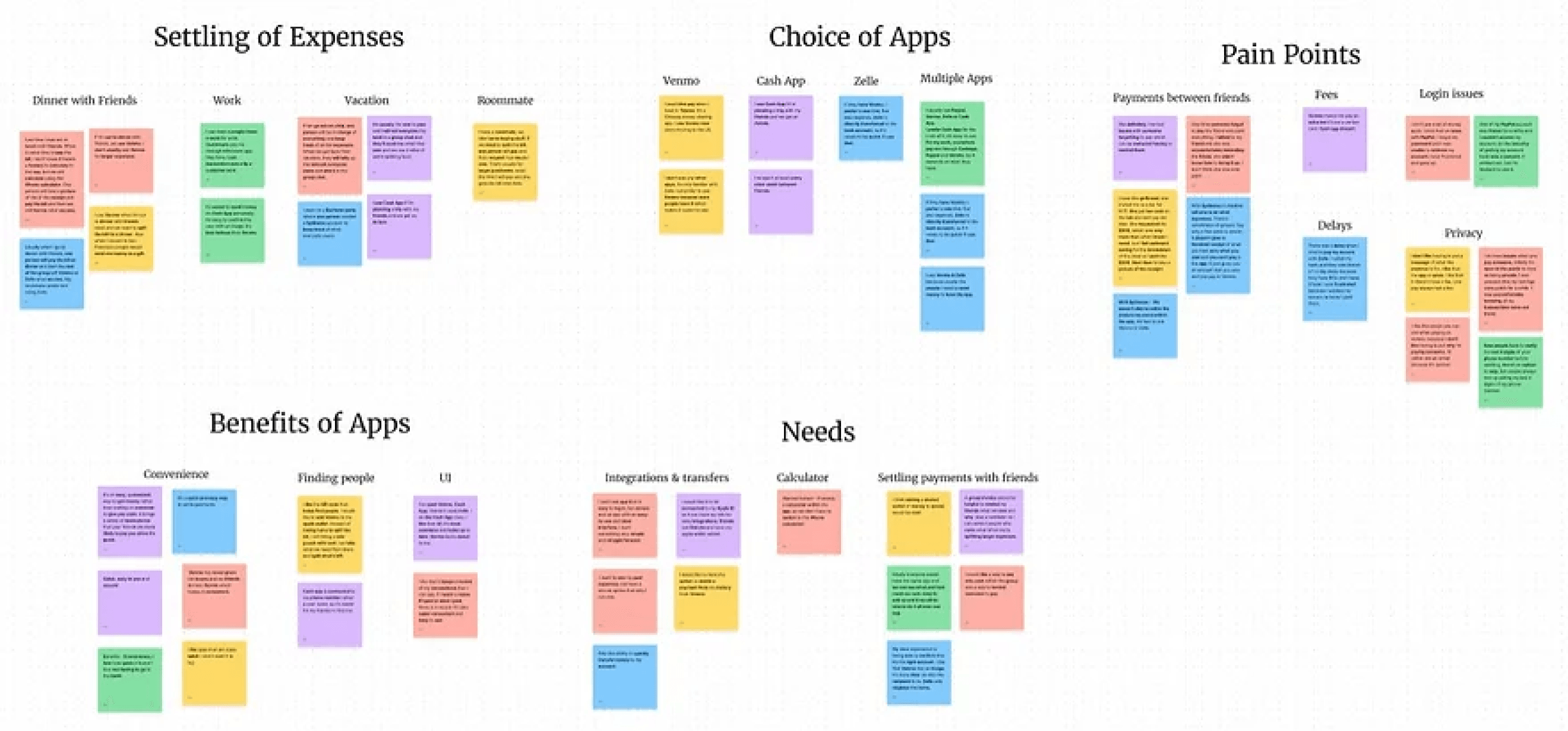
I conducted user interviews with five people over Zoom to better understand what it is people look for when choosing a P2P money-sharing app. I then created an Affinity Map to find commonalities and pain points.
Interview and Affinity Mapping Takeaways
Uncomfortable follow-up
85% Consider Security
The most important factor to users is convenience, security
80% One Person Pays
One individual pays the bill and then sends everyone the amount owed in a group chat.
Ideate
Task Flows
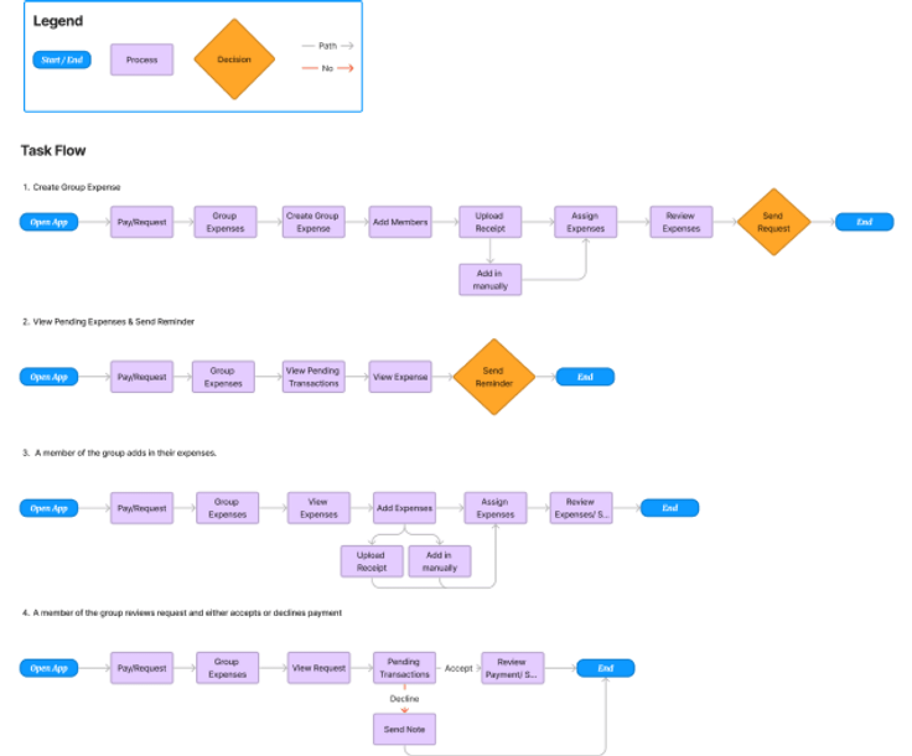
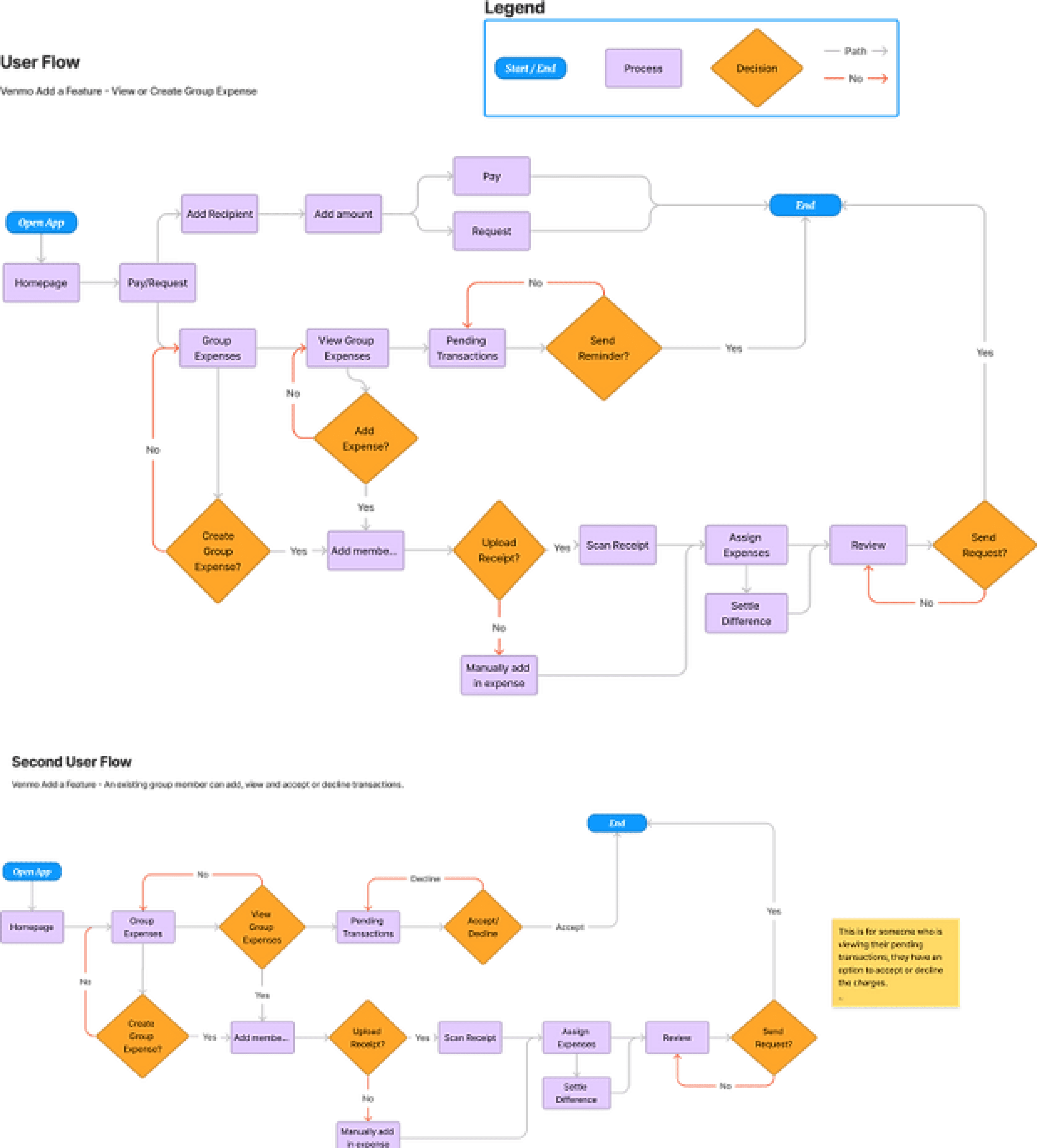
The three Task Flows I created focused on creating a group expense, viewing pending expenses, sending reminders, and members adding their expenses.
User Flow
After mapping out the established tasks, I created user flows for group expenses. This includes creating an expense, uploading a receipt, and sending a reminder. Another user flow shows an existing group member viewing a request and choosing to accept or decline it. In this way, I can walk in a user's shoes and think through different scenarios this user might encounter.
Design
Lo-Fi Wireframes
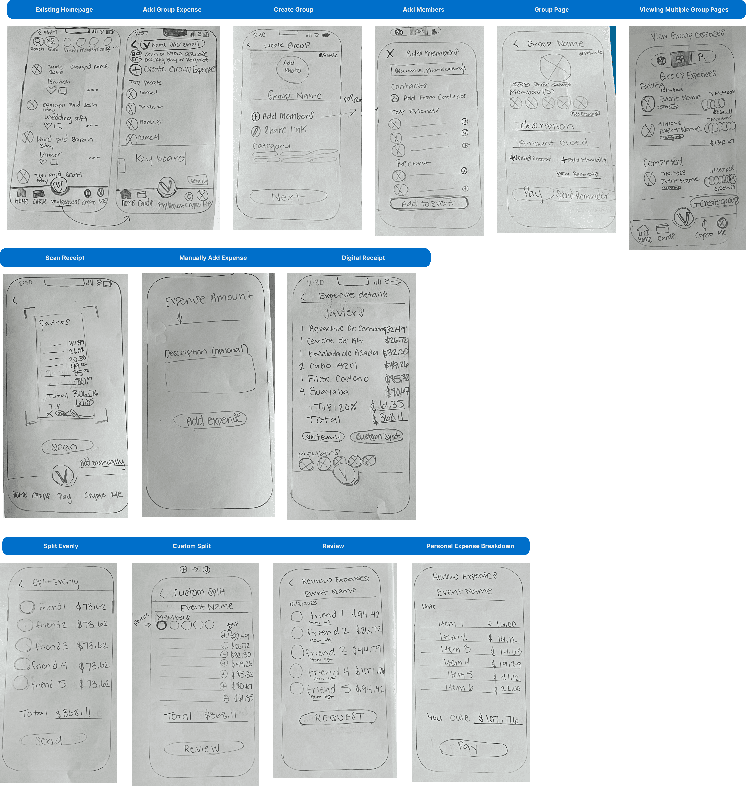
I began by building low-fidelity sketches on paper, minimal digital work. I quickly iterated desired functions and desired user flows. This allows me to make iterations easily and ensure that the final screen designs combine the best elements that address user pain points while envisioning and quickly testing if the complete flow works.
Hi-Fi Wireframes
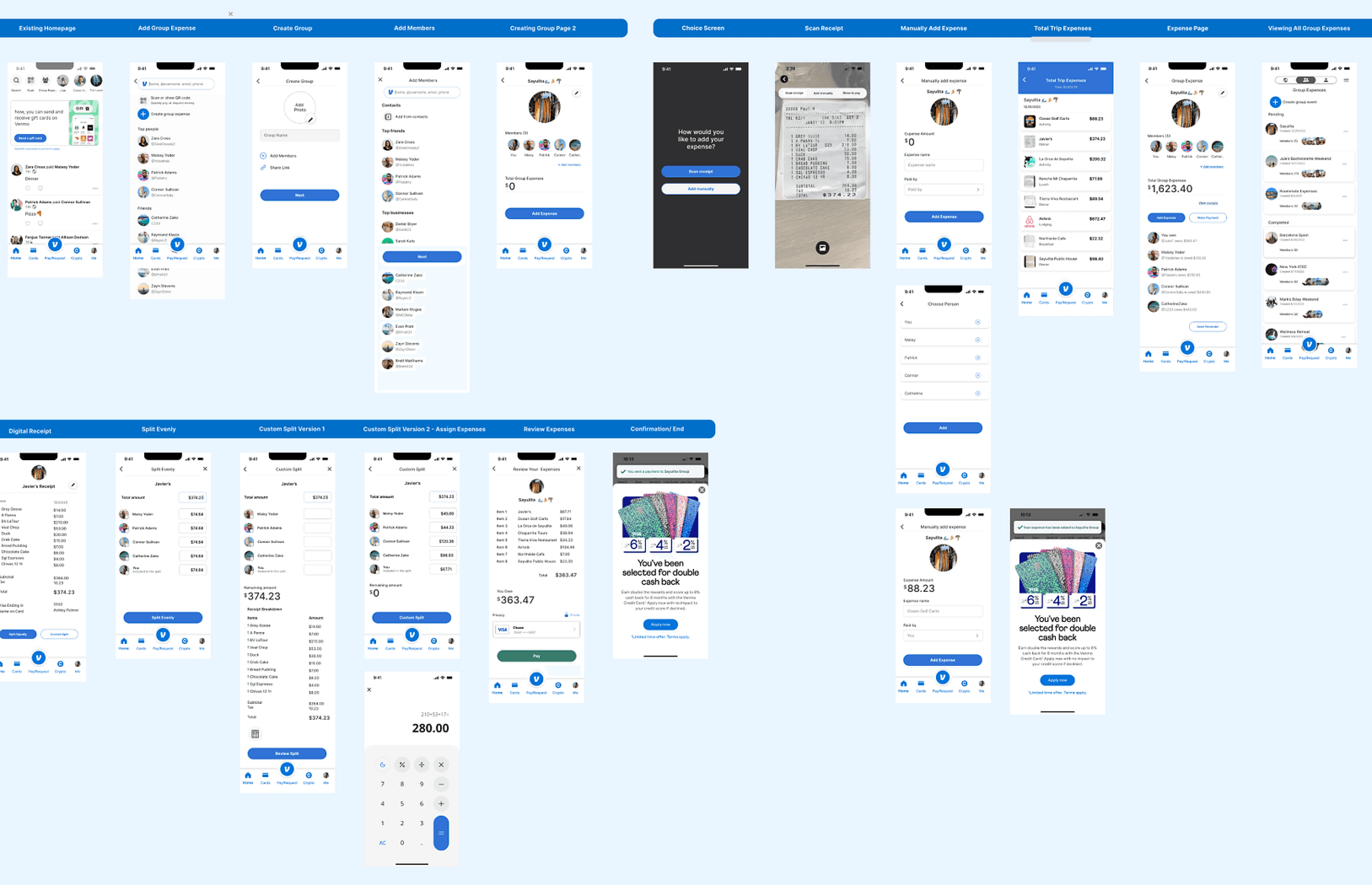
A high-fidelity wireframe represents the final stage of the design process before moving on to development. In addition to illustrating the app's interface and design details, these wireframes lay the foundation for the Venmo feature.
Hi-Fi Prototype
The prototype, developed post high-fidelity wireframes, is for usability testing to gain user experience insights and identify improvement areas. The testing results will guide refinements before the feature's live implementation on the app, ensuring a smooth experience for Venmo users.
Testing
Usability Testing
The usability test evaluates a newly added feature in Venmo. Participants will perform tasks using the prototype, and their interactions, feedback, and observations will be recorded.
The test assesses the feature's effectiveness, user-friendliness, and alignment with user expectations. Insights gained from the test will identify strengths, weaknesses, and areas for improvement before final implementation.
Screens that received the most feedback:
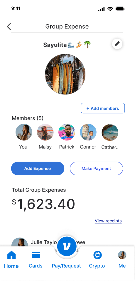
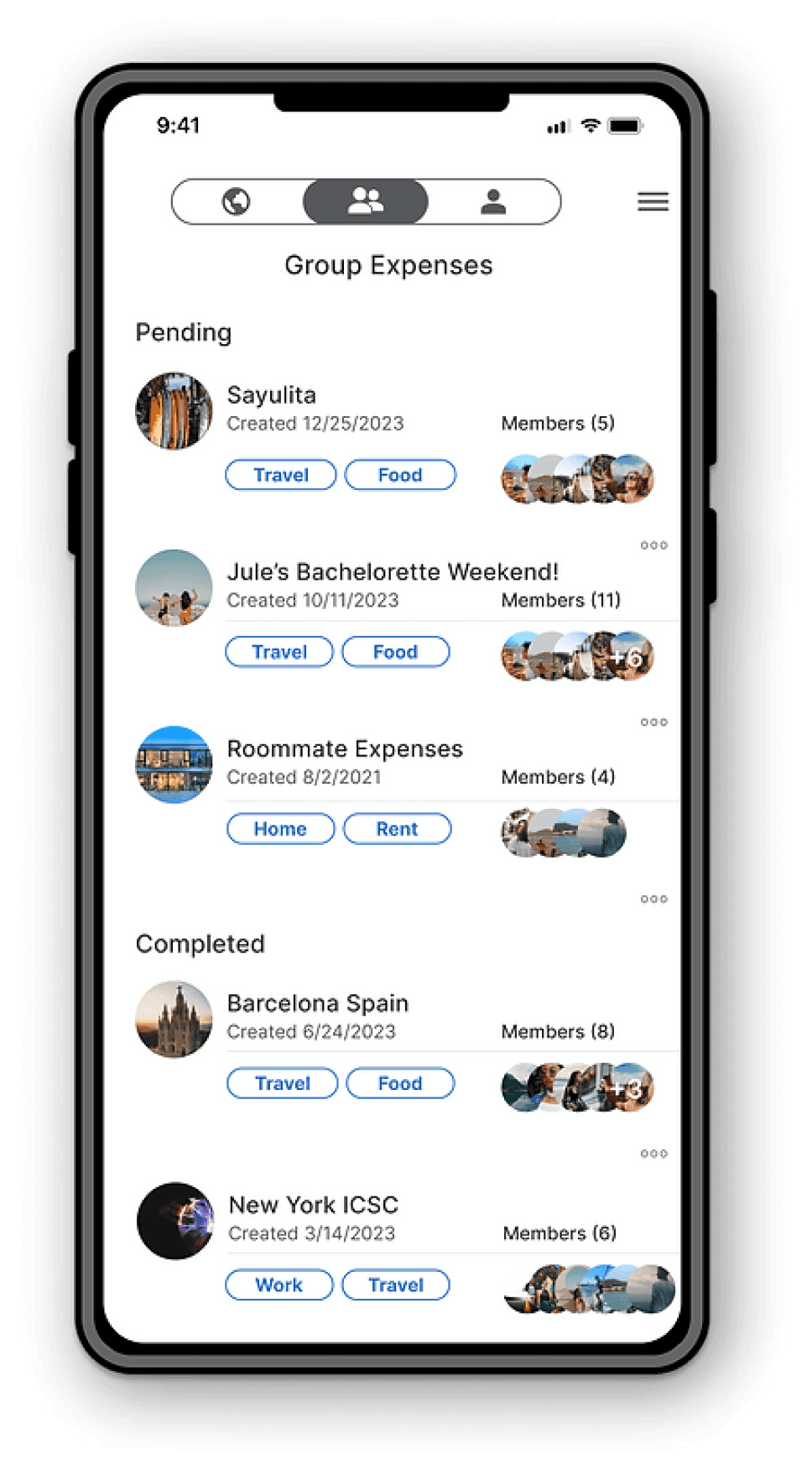
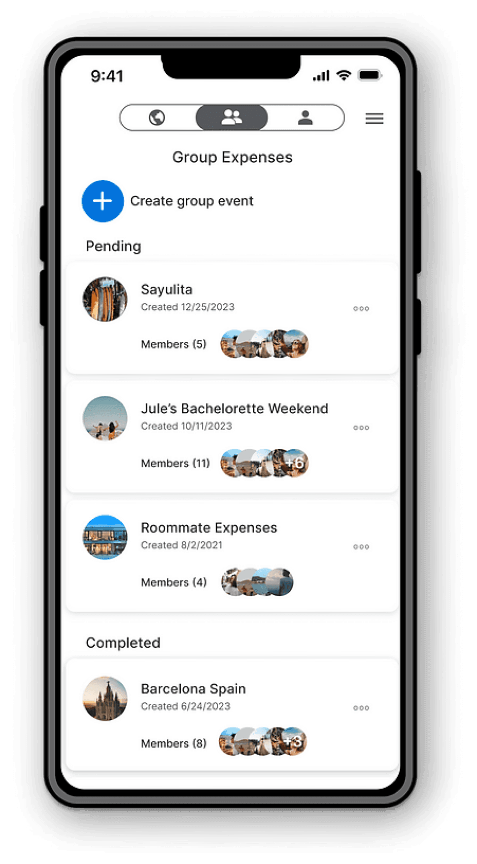
GROUP EXPENSE PAGE
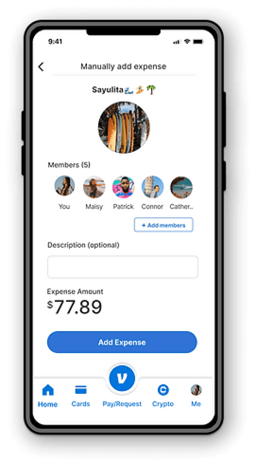
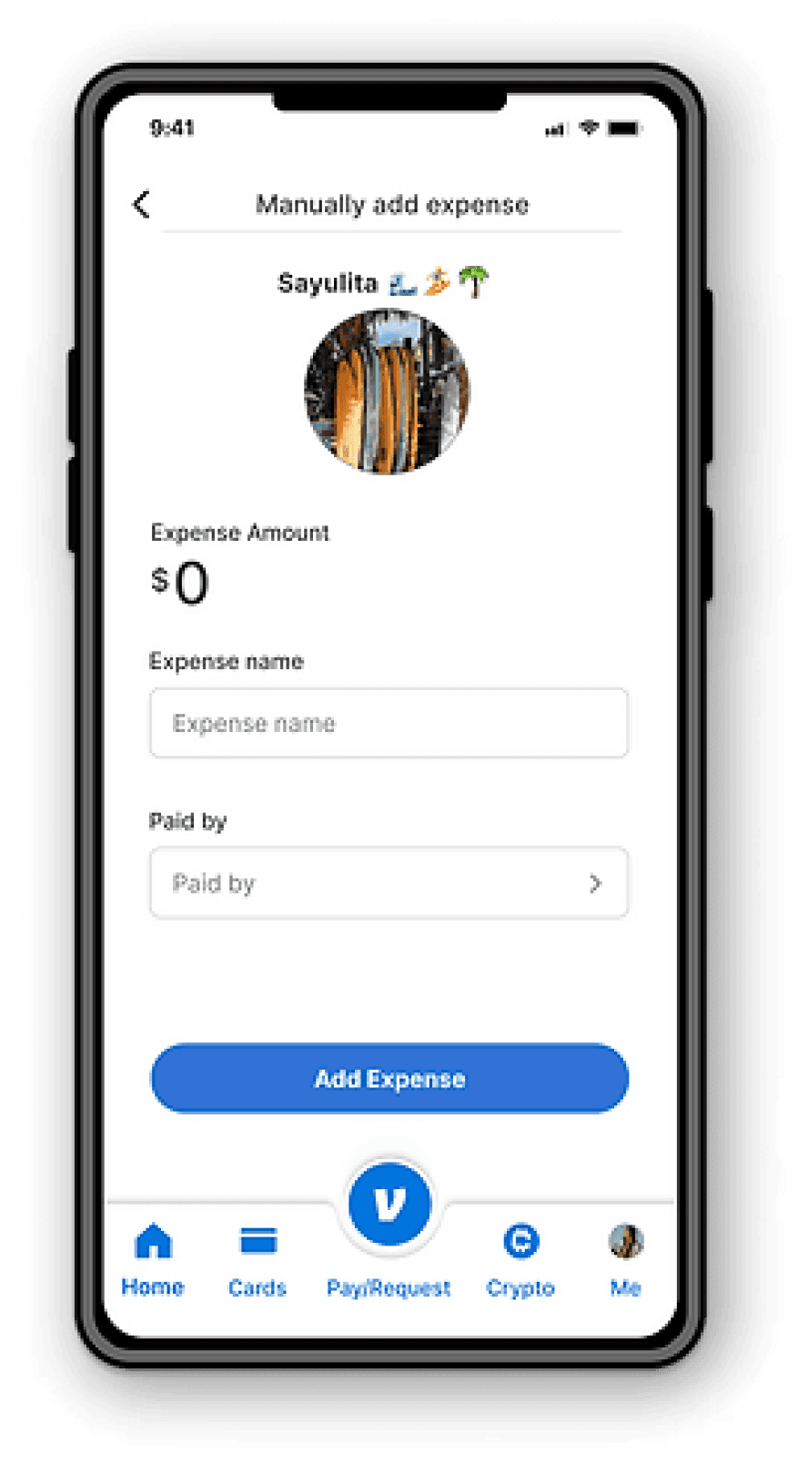
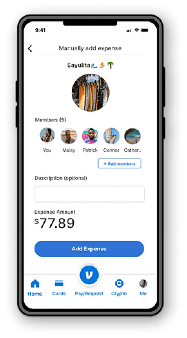
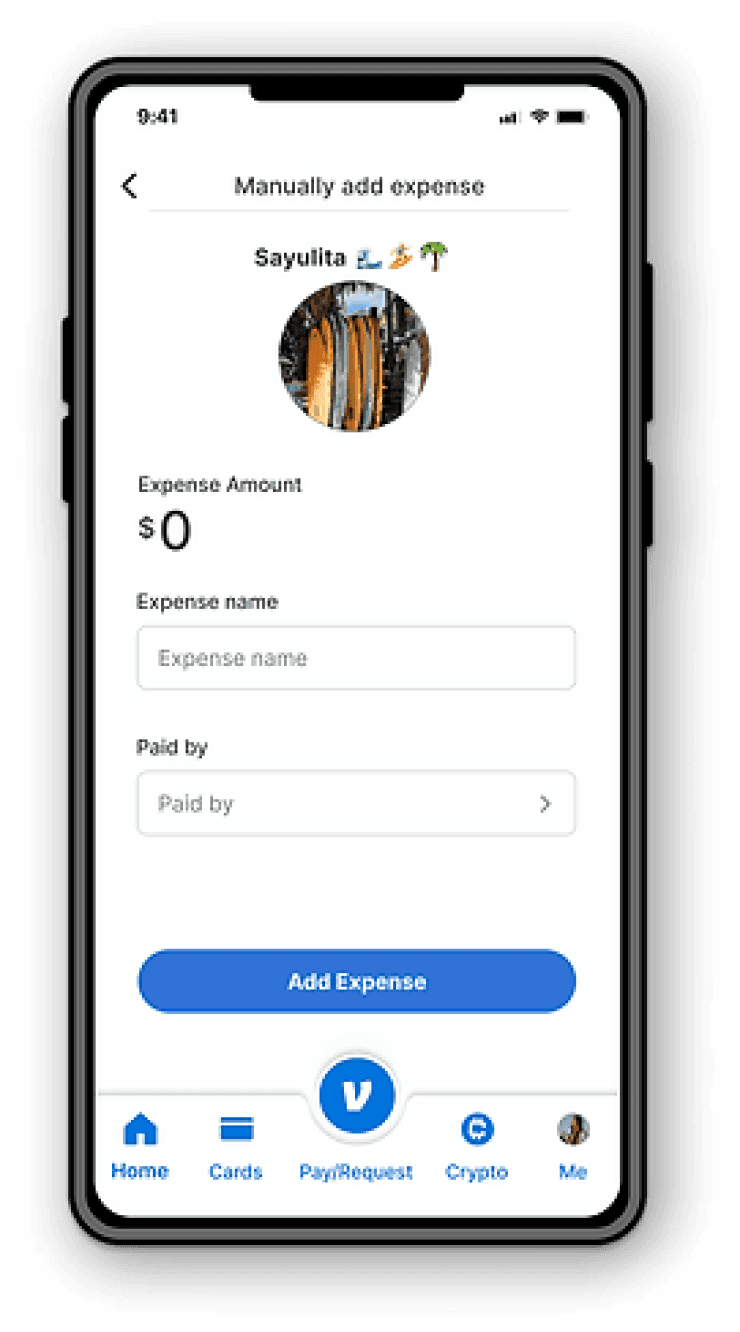
MANUALLY ADD EXPENSE
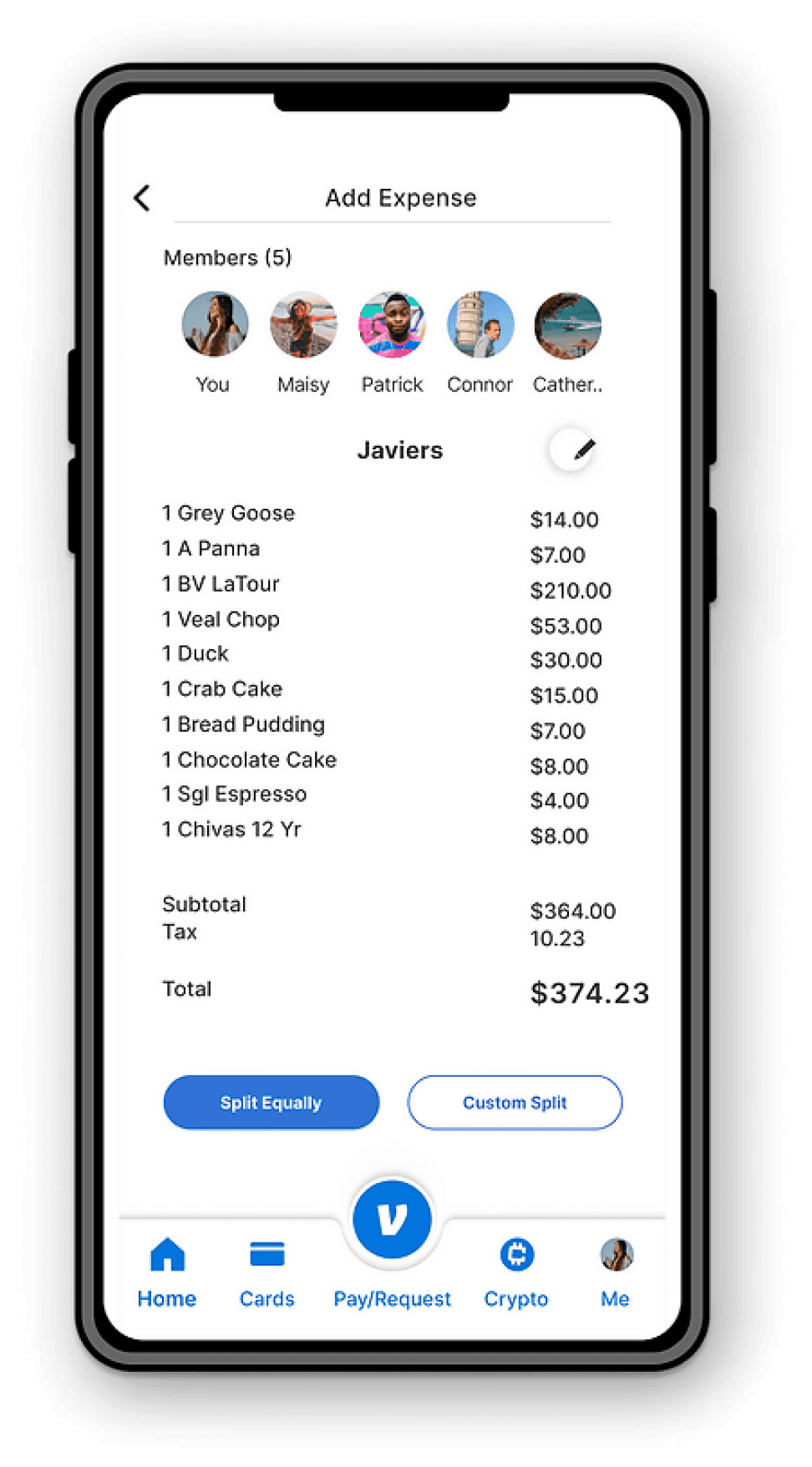
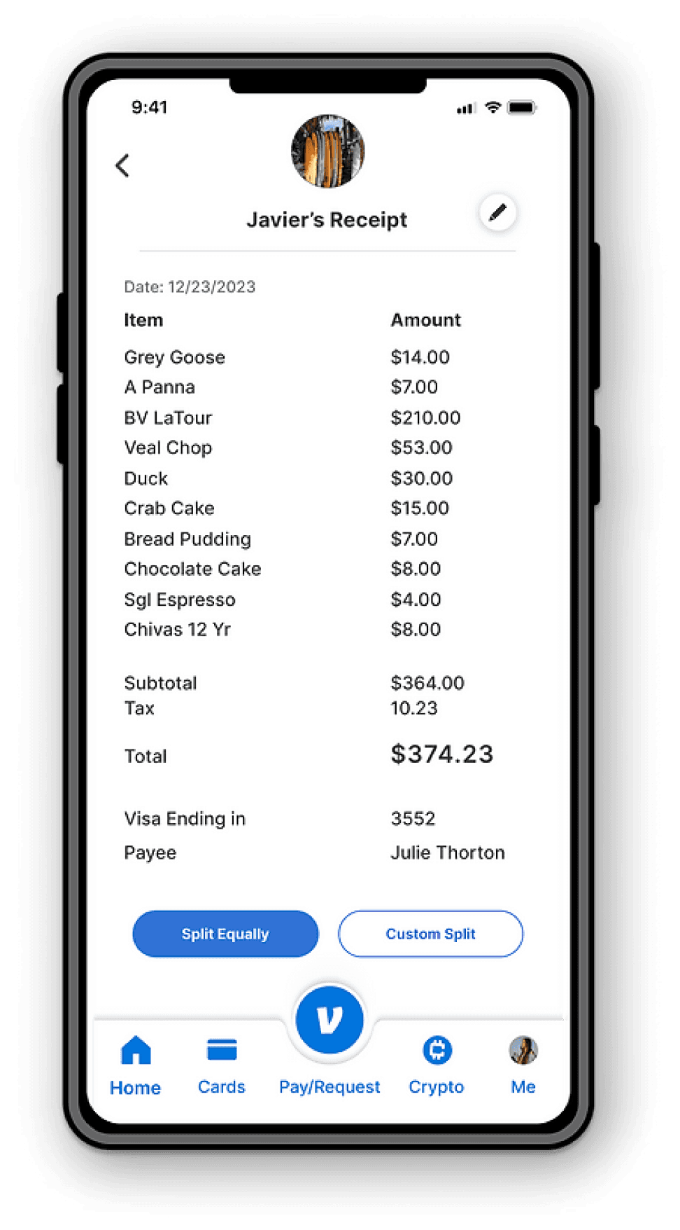
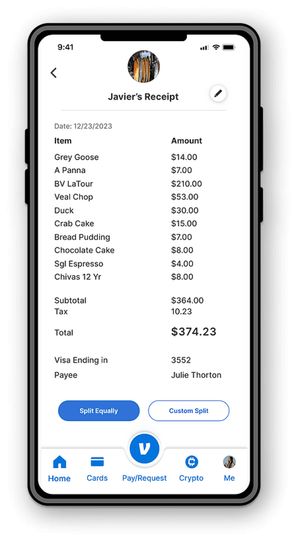
JAVIER’S RECEIPT
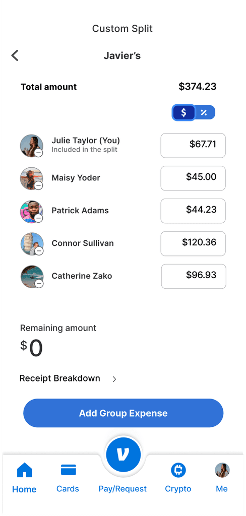
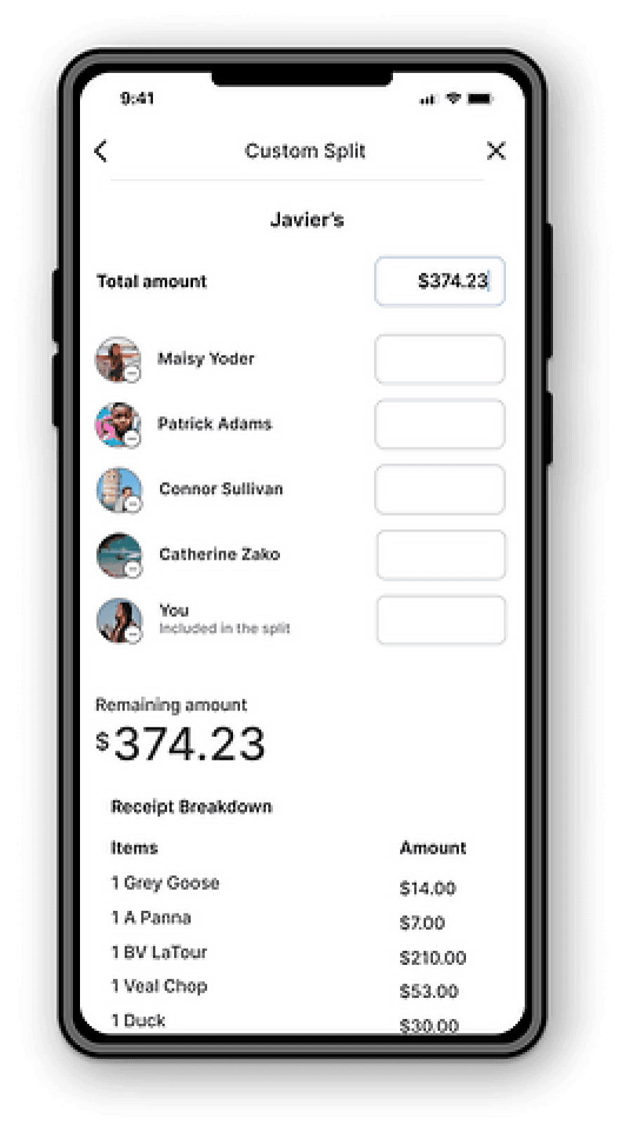
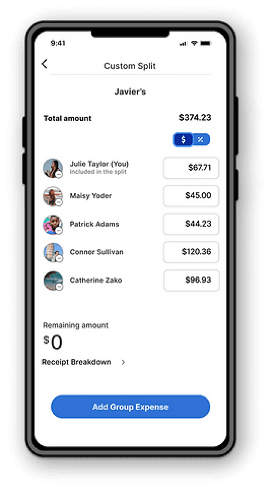
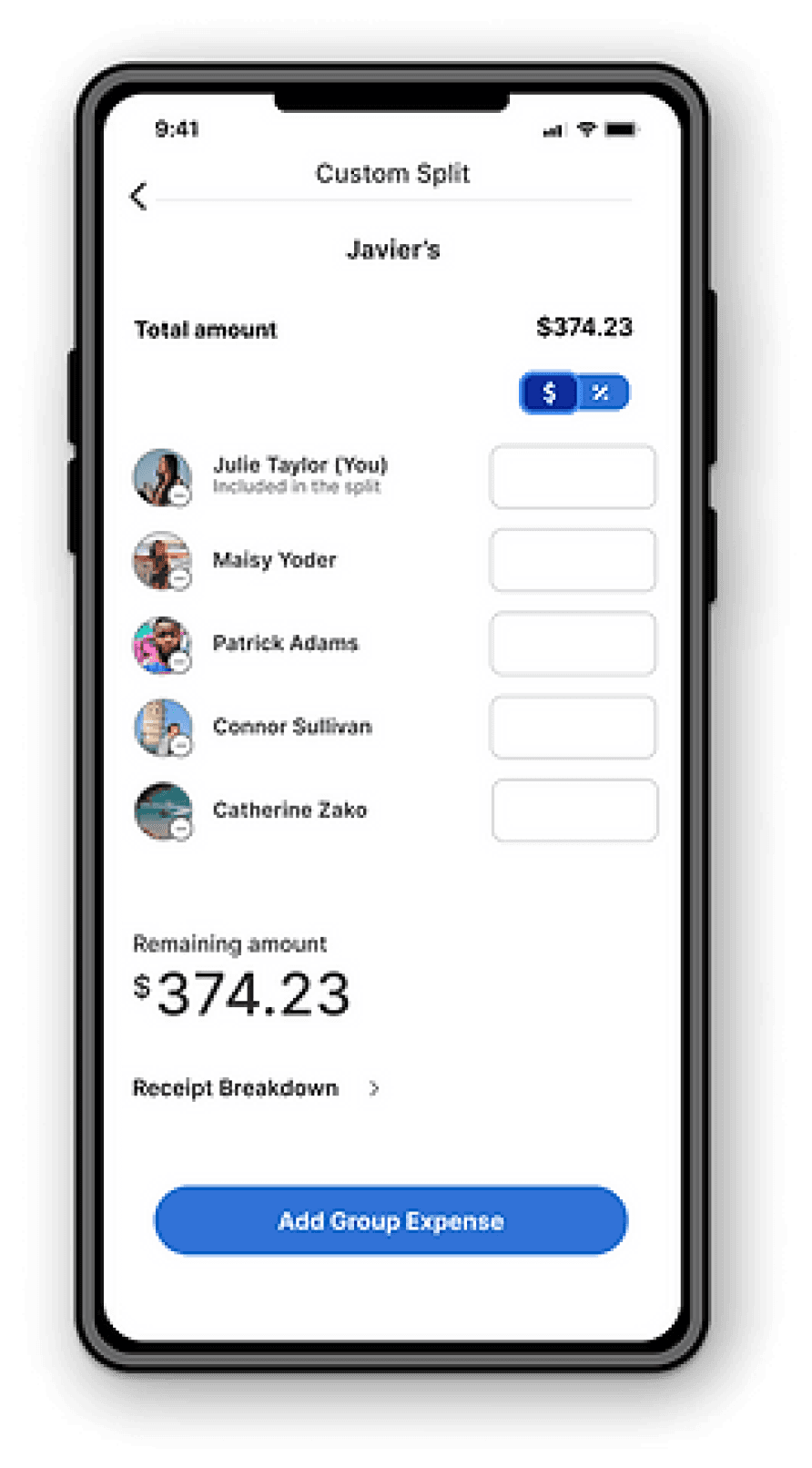
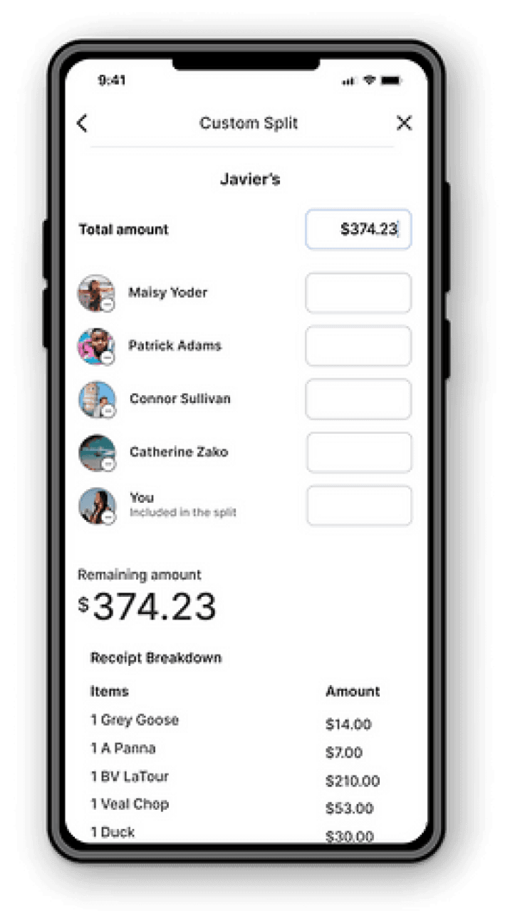
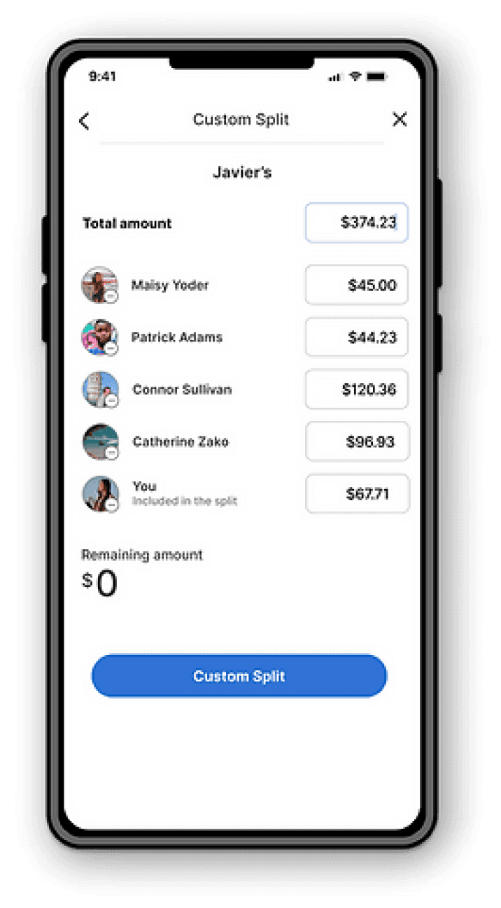
CUSTOM SPLIT
Areas of Improvement
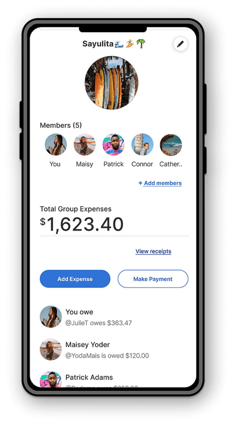
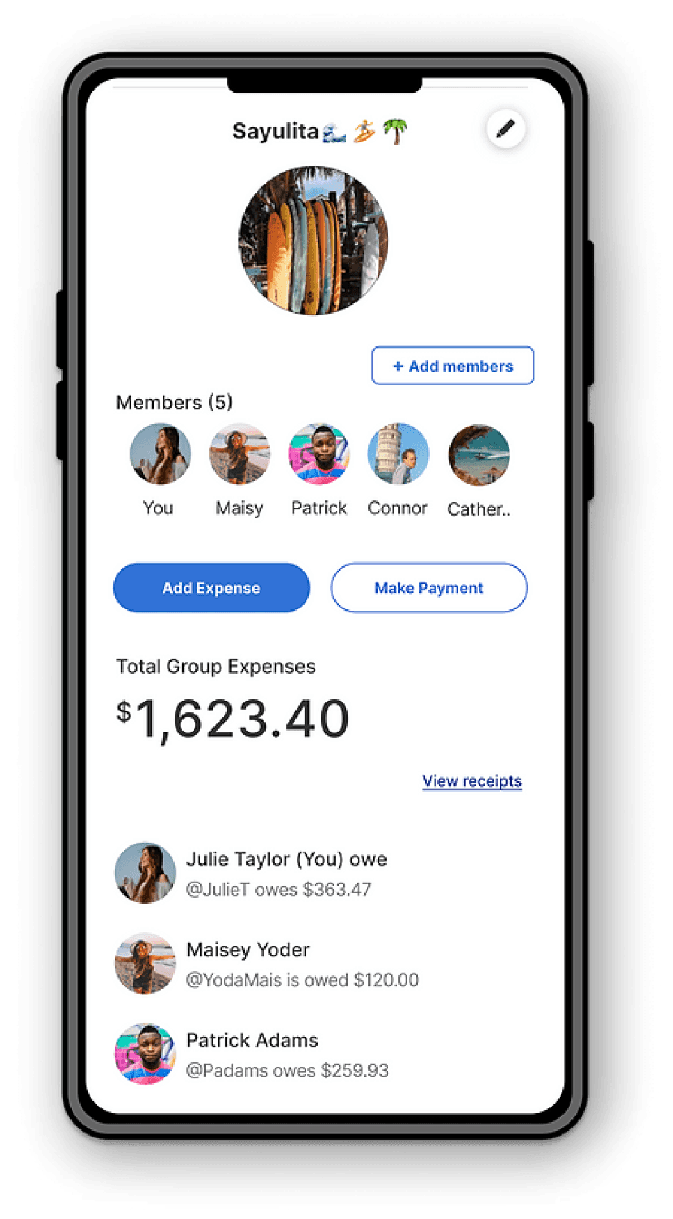
• Existing Group Expense: Grouping the total group expenses and adding the user's name.
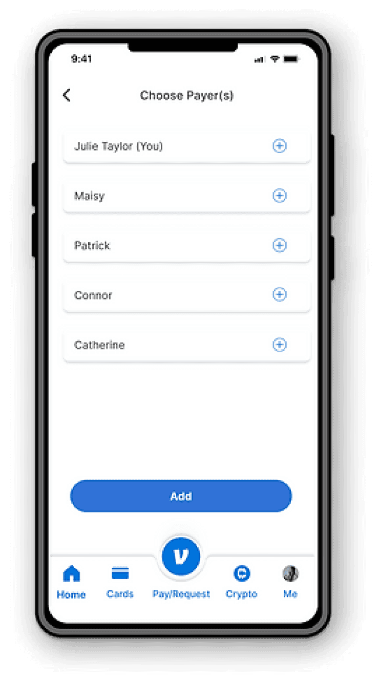
• Adding Expense: Removing the members and specifying the user to clear up the language and clarify whom the expense is paid by.
• Javier’s Receipt: Focusing on the receipt details and removing unnecessary distractions.
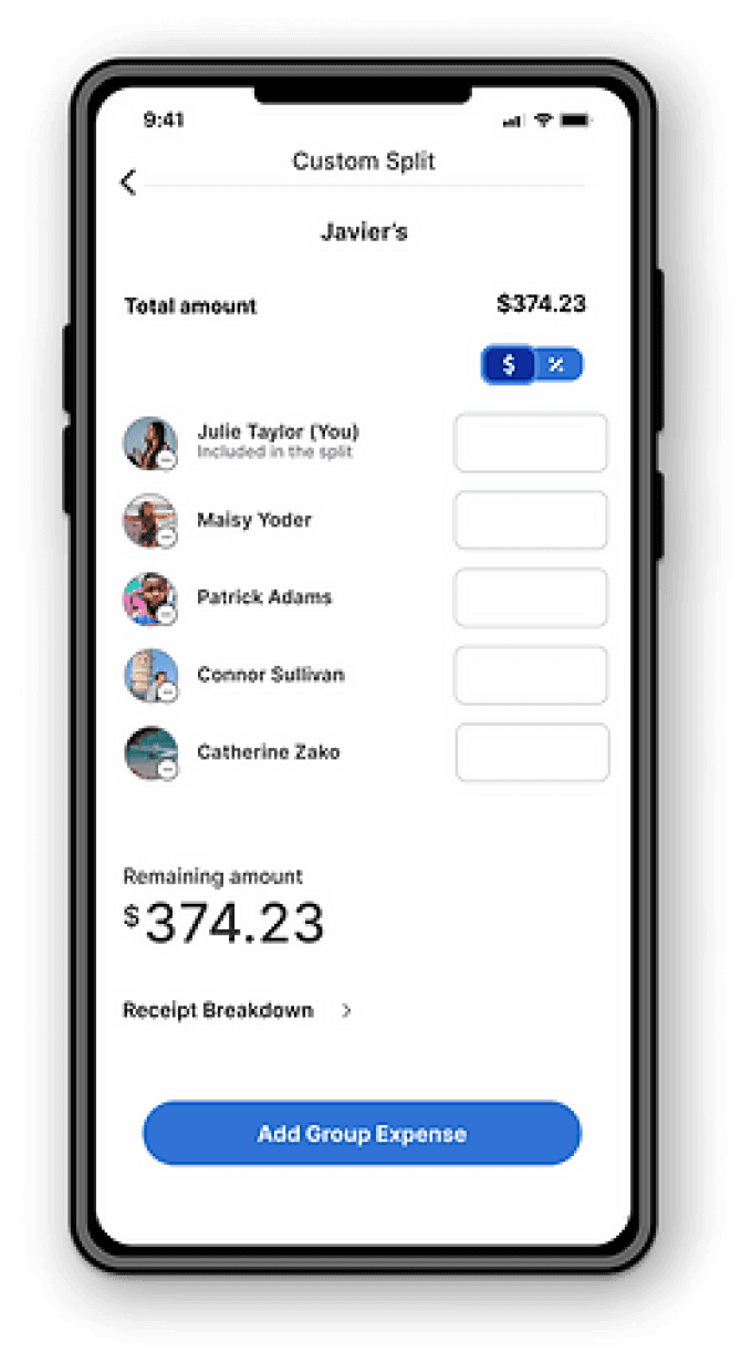
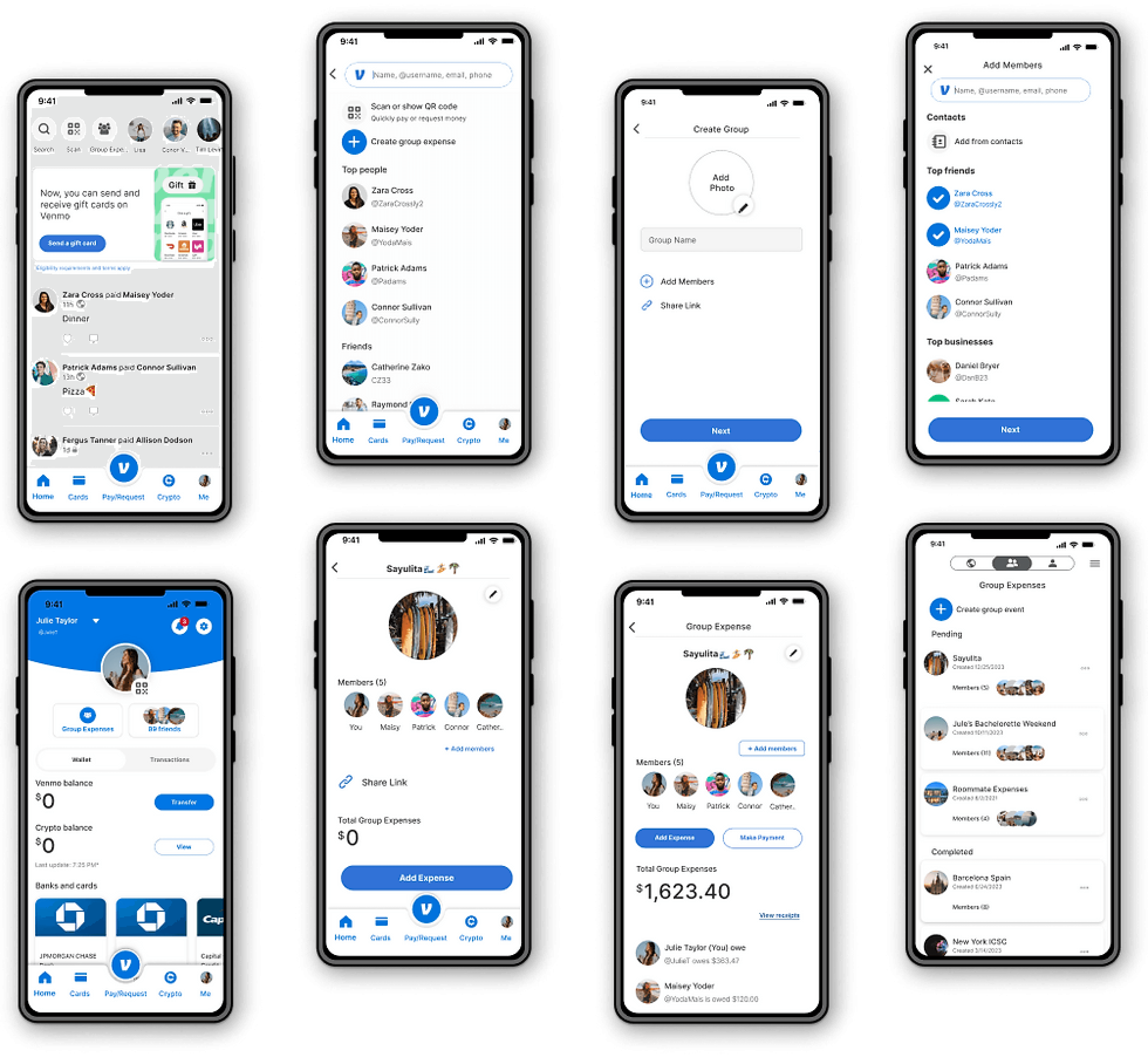
• Custom Split Screen: Adding a collapse feature to the receipt breakdown, reordering the names to have the personal user listed first with their full name, and adding a choice to split by dollar amount or percentage.
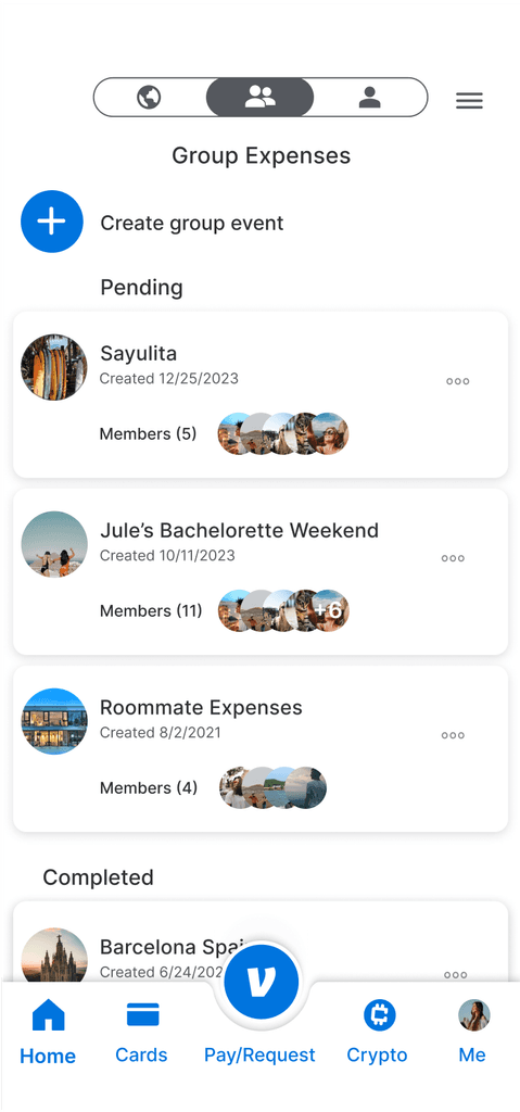
• All Group Expenses: Removing categories as users found them unnecessary and distracting. Instead, the groups have been transformed into cards, making it clear for users to know which group to click on.
Iterations
Final Design
Reflection
Working on Venmo's Group Expense feature has been an enriching experience. Refining the Custom Split feature taught me the importance of balancing flexibility and user-friendliness.
User feedback was crucial in shaping the feature. By involving users in the design process, I ensured it aligns seamlessly with Venmo's UI and brand guidelines. Based on user feedback, I made improvements to the Custom Split feature. One enhancement was adding a collapse feature to the receipt breakdown, allowing users to focus on what's essential.
Given more time, I would revisit the receipt breakdown implementation, finding innovative ways to integrate it smoothly into Venmo's UI for a better user experience.
