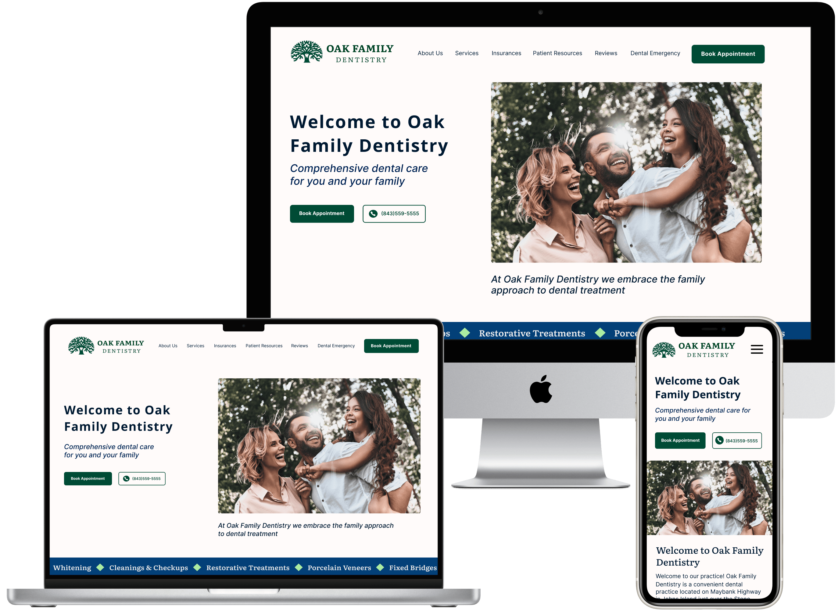
Responsive Website Redesign

Redesigning a Dentistry's website to be more efficient and increase customer engagement.
ROLE

UX Designer

EXPERTISE

UX/UI Design

YEAR

2024

Overview

Oak Family Dentistry is a highly-rated dentistry based in Charleston. They have a family approach to dentistry and offer personalized dental care for cosmetics, cleanings, emergencies, and more. Their team is built on the belief that you’re more than just a number.

Problem

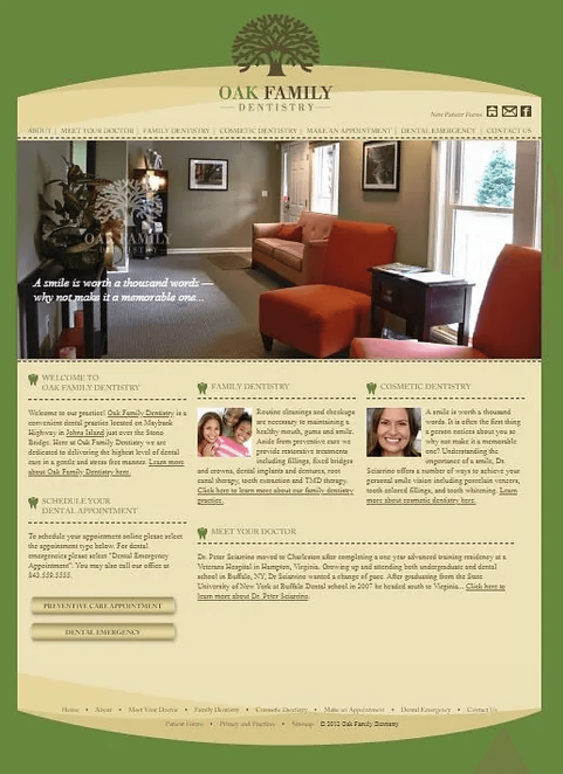
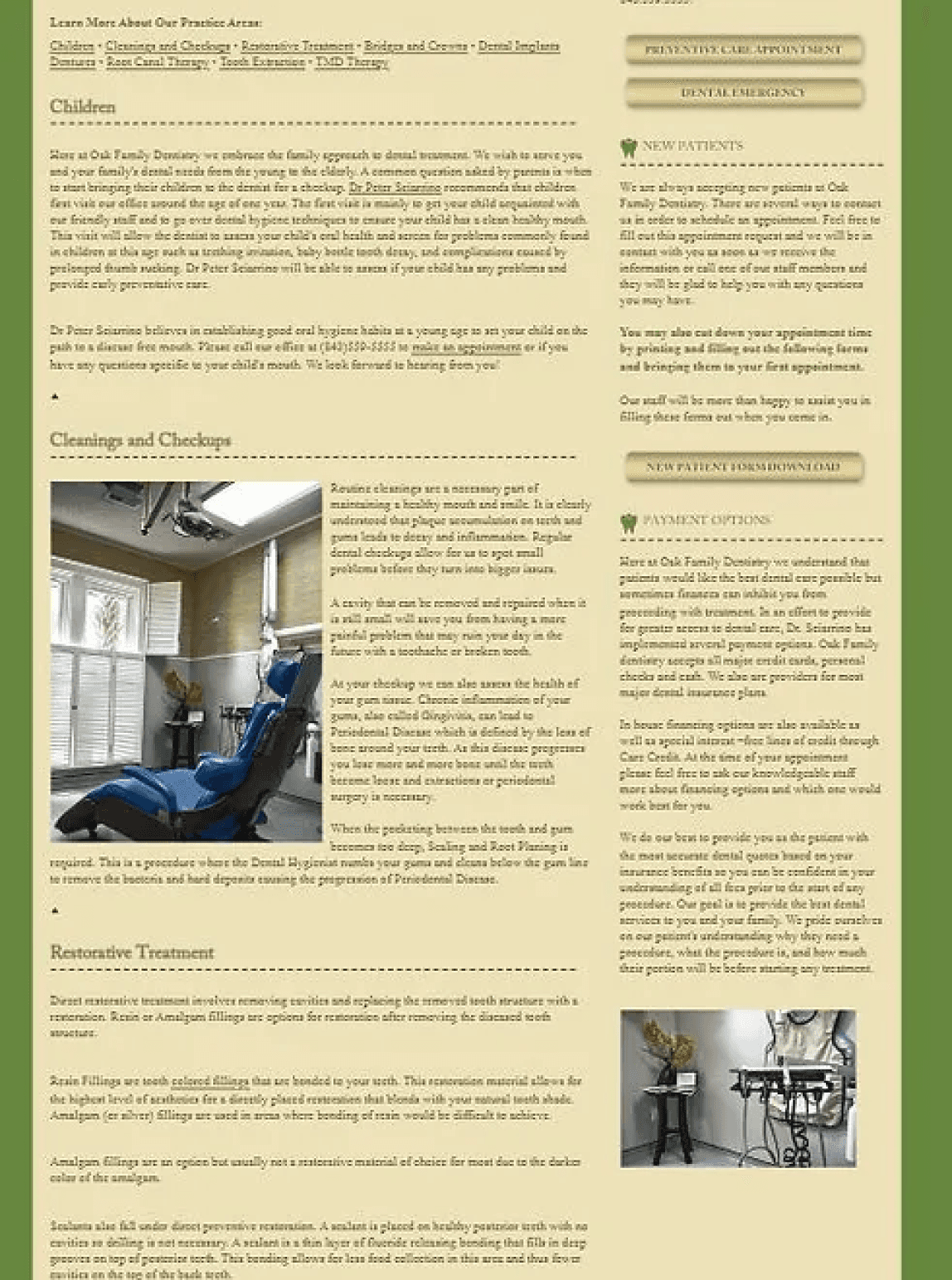
Despite Oak Family Dentistry's success, its website needs improvement due to its outdated appearance, hard-to-find booking tools, and difficult navigation.

Solution

Foodwise, a mobile app, enables users to cook healthy meals by providing simple ingredient explanations and nutritional details. It also allows the saving, sharing, and viewing of meal nutrition information for a comprehensive health overview.

Research

Research

Objectives

Maintain approachability, personally interact with consumers, and establish a recognizable business meeting client's objectives.

Develop an updated site that systematically displays business information, images, and products online.

Develop an updated site that systematically displays business information, images, and products online.

Understand what the target audience looks for when booking an appointment and streamline the booking process.

Understand what the target audience looks for when

booking an appointment and streamline the booking process

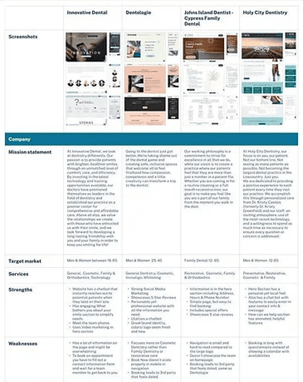
Competitive Analysis

In my analysis, I examined the following:

  • Explored layout options

  • Analyzed hero sections

  • Identified information gaps

  • Assessed elements' accuracy and relevance for individual preferences

  • Gained insights for Oak Family Dentistry redesign

Analysis Conclusion

Successful websites use clear communication, strategic marketing, accessible information, and user-friendly designs.

Analysis Conclusion

Successful websites use clear communication, strategic marketing, accessible information, and user-friendly designs.

Analysis Conclusion

Successful websites use clear communication, strategic marketing, accessible information, and user-friendly designs.

Successful websites use clear communication, strategic marketing, accessible information, and user-friendly designs.

User Interviews

Interview Summary

A dental website should be friendly, professional, and show expertise to make customers comfortable. They want to avoid salesmen like dentists, so transparency and reviews are important.

A dental website should be friendly, professional, and show expertise to make customers comfortable. They want to avoid salesmen like dentists, so transparency and reviews are 

important.

Define

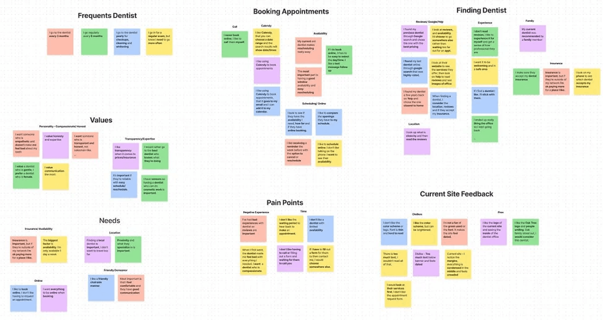
Affinity Map

I synthesized my qualitative data using an affinity map, which allowed me to group observations, identify patterns, and develop insights. This included visit frequency, appointment scheduling, dentist search, user values, needs, pain points, and website feedback.

Define

Key Takeaways

65% prefer online booking

Users prefer to book online rather than calling and prioritize easy scheduling.

Users prefer to book online rather than calling and prioritize easy scheduling.

70% value transparency

Users value transparency when it comes to insurance and pricing.

Users value transparency when it comes to insurance and pricing.

80% rely on reviews

Users rely on customer reviews when choosing a new dentist.

Users rely on customer reviews when choosing a new dentist.

User Personas

Analysis insights and a user map led to the creation of three personas - The Frequent Patient, The Online Booker, and The Apprehensive Patient. These personas encapsulate goals, needs, interests, motivations, and challenges, and are used in design to align with business and customer objectives.

Allison

@The Frequent Patient

Allison, an anesthesiologist, needs a family-friendly cosmetic dentistry specialist. She sets appointments by call and requires a detailed information website.

Jen

@The Online Booker

College student Jen needs a local, family-friendly dentist within her insurance network that offers easy online booking. She prefers one close by due to a variable schedule, and values experience with orthodontics.

Chris

@The Apprehensive Patient

Chris fears dental work but values it. He's looking for an empathetic local dentist accepting his insurance, with choice driven by reviews.

Redesign Implementation

Redesign Implementation

Booking: Simplify the booking process to encourage appointments.

Navigation: Enhance the readability and usability of navigation elements for easy browsing.

Information Architecture: Offer accessible service and insurance lists for user ease.

Usability Concerns: Eliminate complicated third-party bookings, excessive information, and unclear content to improve user experience.
Ideate

Ideate

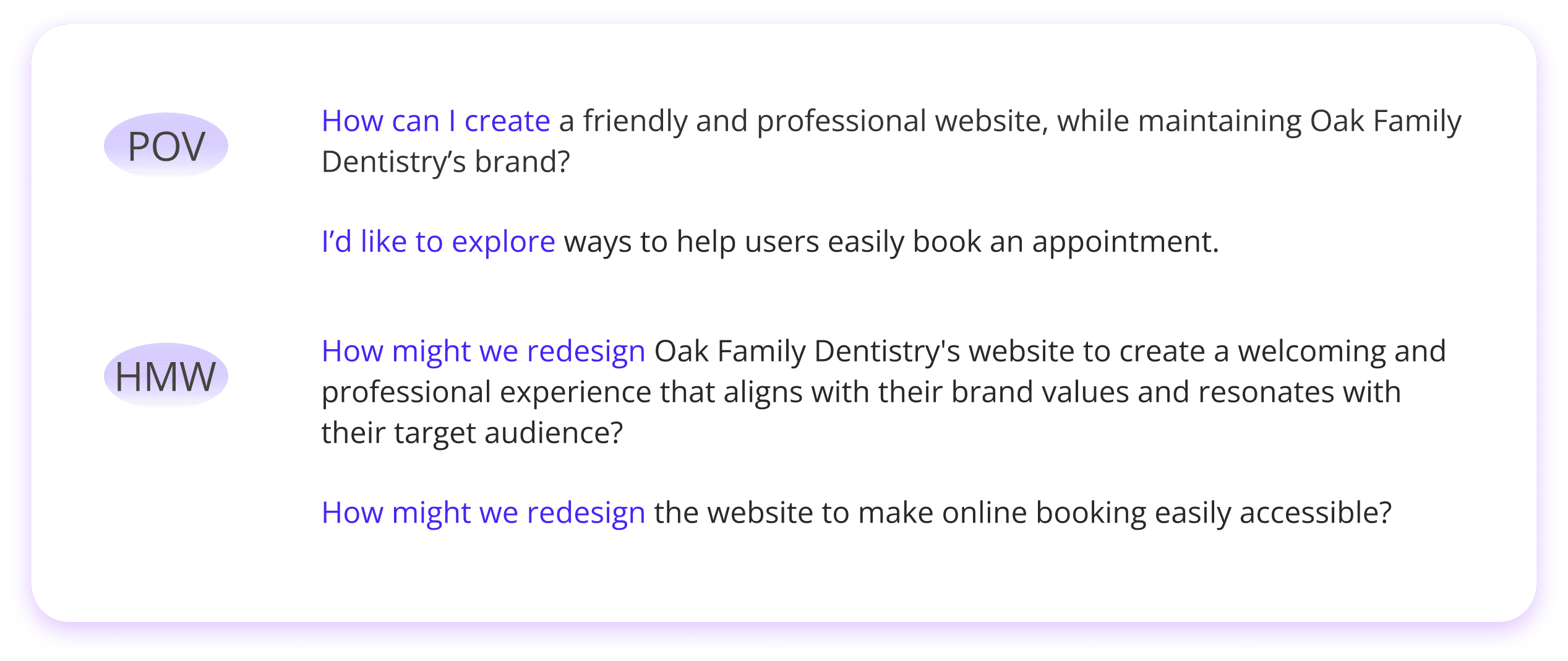
POV

How can I create a friendly and professional website, while maintaining Oak Family Dentistry’s brand?

I’d like to explore ways to help users easily book an appointment.

HMW

How might we redesign Oak Family Dentistry's website to create a welcoming and professional experience that aligns with their brand values and resonates with their target audience?

How might we redesign the website to make online booking easily accessible?

Mid-Fi Wireframes

For the mid-fi wireframes, I reorganized the same information from the existing Oak Family Dentistry pages into a more cohesive layout. The pages include:

These pages include:

Homepage

Services

About Us

Reviews

Payment & Insurance

Dental Emergency

Patient Forms

Design

Mid-Fi Wireframes

For the mid-fi wireframes, I reorganized the same information from the existing Oak Family Dentistry pages into a more cohesive layout. The pages include:

  • Homepage

  • Services

  • About Us

  • Reviews

  • Payment & Insurance

  • Dental Emergency

  • Patient Forms

Mid-Fi Wireframes

For the mid-fi wireframes, I reorganized the same information from the existing Oak Family Dentistry pages into a more cohesive layout. The pages include:

These pages include:

Homepage

Services

About Us

Reviews

Payment & Insurance

Dental Emergency

Patient Forms

Desktop Mid-Fi Wireframes

Mobile Mid-Fi Wireframes

Desktop Mid-Fi Wireframes

Mobile Mid-Fi Wireframes

Visual Design

It was important for me to maintain the professional and inviting feel of the original site while adhering to the color scheme and inspiration from the Oak Dentistry name and logo.

It was important for me to maintain the professional and inviting feel of the original site while adhering to the color scheme and inspiration from the Oak Dentistry name and logo.

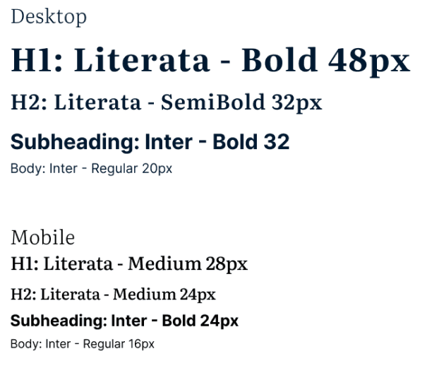
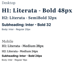
Typography

Primary

Color Palette

034078

A7CCED

63ADF2

Primary

001F54

03966A

004B35

Secondary

001931

E4DFDA

FFFBFA

Neutral

Default

Hover

Ghost

Secondary

Small

Book Appointment

Book Appointment

Book Appointment

Learn More

Learn More

Learn More

Learn More

Learn More

Learn More

Learn More

Learn More

Learn More

Buttons

Version 3 Final

Considering the feedback from the Version 2 logo, I decided to keep the original tree. The tooth is easier to see in this logo than in the 2nd version. To give an updated look, I changed the font to Literata and changed the entire color to a deep green, #004323.

Original Logo

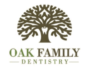
The original logo was a mixture of brown & green, the dentistry part was small to the eye.

Version 2

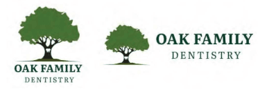
This logo was created but after considering the established branding I thought it would be best to stick closer to the original branding. After feedback, I also learned the tree on this design may be too intricate if it came to printing.

Logo

Visual Design

It was important for me to maintain the professional and inviting feel of the original site while adhering to the color scheme and inspiration from the Oak Dentistry name and logo.

Typography

Primary

Color Palette

034078

A7CCED

63ADF2

Primary

001F54

03966A

004B35

Secondary

001931

E4DFDA

FFFBFA

Neutral

Default

Hover

Ghost

Secondary

Small

Book Appointment

Book Appointment

Book Appointment

Learn More

Learn More

Learn More

Learn More

Learn More

Learn More

Learn More

Learn More

Learn More

Buttons

Version 3 Final

Considering the feedback from the Version 2 logo, I decided to keep the original tree. The tooth is easier to see in this logo than in the 2nd version. To give an updated look, I changed the font to Literata and changed the entire color to a deep green, #004323.

Original Logo

The original logo was a mixture of brown & green, the dentistry part was small to the eye.

Version 2

This logo was created but after considering the established branding I thought it would be best to stick closer to the original branding. After feedback, I also learned the tree on this design may be too intricate if it came to printing.

Logo

Desktop Hi-Fi Wireframes

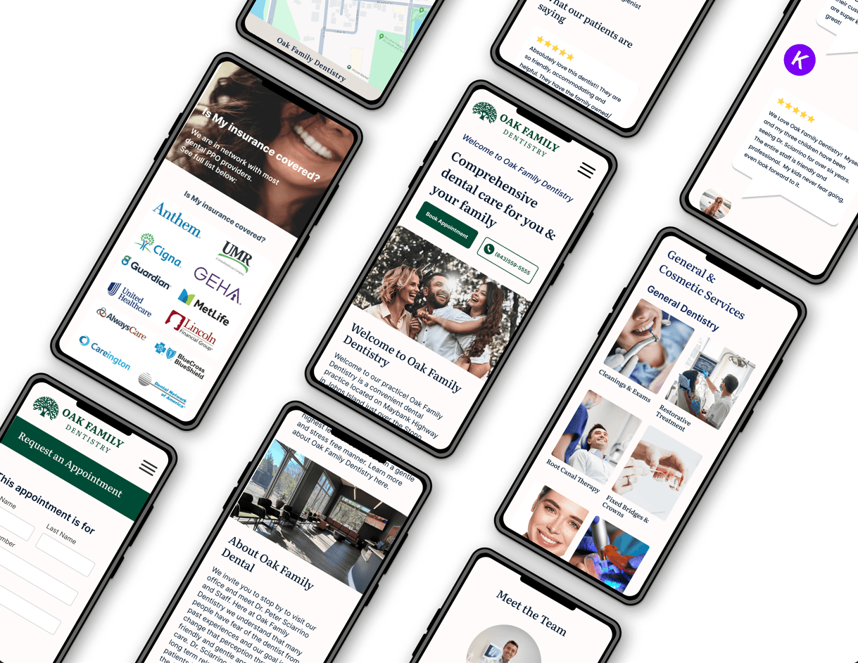
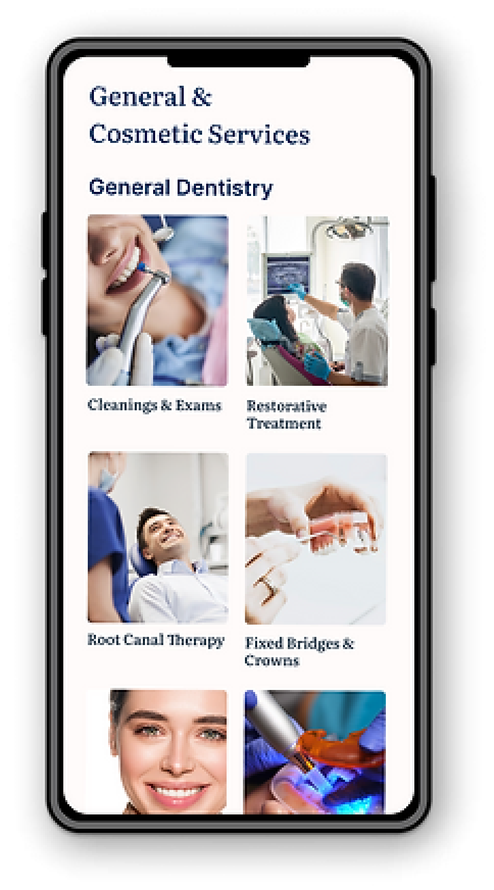
Mobile Hi-Fi Wireframes

A usability test on Oak Family Dentistry's new website was performed to collect user feedback and identify issues. Five interviews, both in-person and via Zoom, assessed user reactions, evaluated tasks like appointment scheduling, and gathered content and navigation feedback. Suggestions were welcomed and user-reported errors were noted.

Tasks

Task #1: Book an appointment for a Root Canal


Task #2: Find information on Porcelain Veneers

Testing

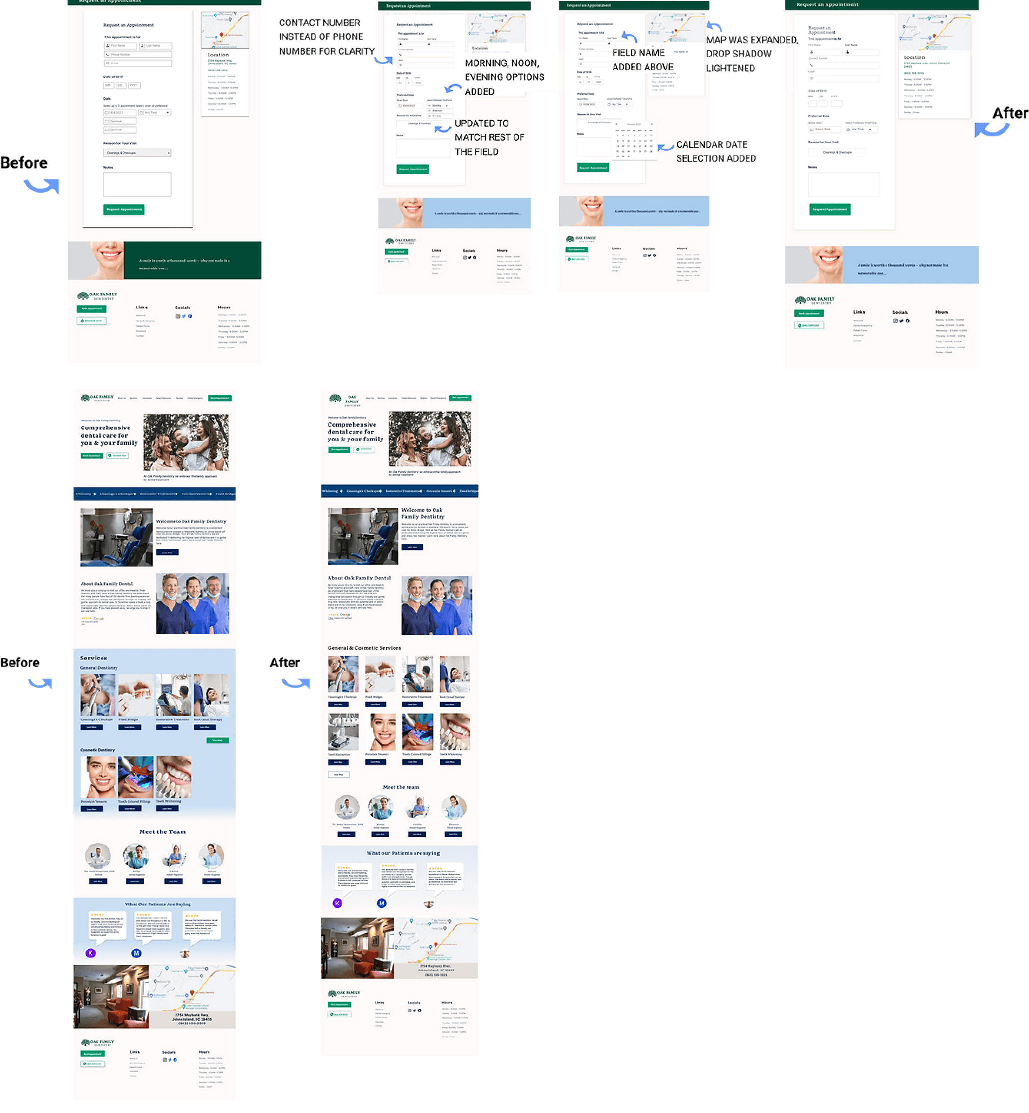
Iterations

Users could navigate the app but recommended enhancements. These include

consolidating the General and Cosmetic Dentistry sections on the Homescreen, eliminating the background color, and repositioning the 'View More' button beneath Services with a blue outline for improved clarity and user experience.

Booking - Add time options: The prototype was set to 'Anytime' during the booking process. The option to request Morning, Noon, or Evening would help users narrow down their time window.


Homepage - Services Section: 3/5 Users couldn’t tell those were two separate sections and thought the View More button looked out of place.

Thank you screen after booking: 1/5 Users noted having some clarity on the timeframe in which they’d get back to you would be helpful.


Button Sizes: The Book Appointment button on the Services Page is smaller than the Request Appointment button on the Booking page. 3/5 Users noted that consistent button sizes would make it easier to book appointments.

Reflection

Redesigning the website of Oak Family Dentistry was an excellent way for me to understand the priorities of users when it comes to viewing services and booking appointments. I discovered the importance of a booking tool and realized that I needed to focus my time more on researching different calendar booking features.


Initially, I focused on improving the appearance and usability of the website's homepage. Later, I realized clients were only able to send a request for booking appointments. This realization led me to redesign the calendar system, which posed some challenges. Despite facing some difficulties in creating a responsive redesign for the calendar, I was able to overcome them and create a successful prototype.

Desktop Mid-Fi Wireframes

Mobile Mid-Fi Wireframes

Prototype

After creating wireframes, a prototype was developed using Figma. This prototype brought the design to life, allowing for user testing and refinement of the user interactions.

Desktop Mid-Fi Wireframes

Mobile Mid-Fi Wireframes

Testing

Collecting user feedback and identifying issues. Five interviews, both in-person and via Zoom, assessed user reactions, evaluated tasks like appointment scheduling, and gathered content and navigation feedback. Suggestions were welcomed and user-reported errors were noted.

Task #1: Book an appointment for a Root Canal

Task #2: Find information on Porcelain Veneers

Tasks

Iterations

Users were able to navigate the app but recommended enhancements. These include consolidating the General and Cosmetic Dentistry sections on the Homescreen, eliminating the background color, and repositioning the 'View More' button beneath Services with a blue outline for improved clarity and user experience.

Booking - Add time options: The prototype was set to 'Anytime' during the booking process. The option to request Morning, Noon, or Evening would help users narrow down their time window.

Homepage - Services Section: 3/5 Users couldn’t tell those were two separate sections and thought the View More button looked out of place.

Thank you screen after booking: 1/5 Users noted having some clarity on the timeframe in which they’d get back to you would be helpful.

Button Sizes: The Book Appointment button on the Services Page is smaller than the Request Appointment button on the Booking page. 3/5 Users noted that consistent button sizes would make it easier to book appointments.

Reflection

Redesigning the website of Oak Family Dentistry was an excellent way for me to understand the priorities of users when it comes to viewing services and booking appointments. I discovered the importance of a booking tool and realized that I needed to focus my time more on researching different calendar booking features.


Initially, I focused on improving the appearance and usability of the website's homepage. Later, I realized clients were only able to send a request for booking appointments. This realization led me to redesign the calendar system, which posed some challenges. Despite facing some difficulties in creating a responsive redesign for the calendar, I was able to overcome them and create a successful prototype.